Graphics Reference
In-Depth Information
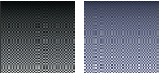
(a)
(b)
Figure 15.2: A pattern for testing the
Image
class. The pattern is a checkerboard of
1
-pixel
squares that alternate between
1
(m
2
sr)
in the blue channel and a vertical gradient
from
0
to
10
. (a) Viewed with
deviceGamma
=
1.0
and
displayConstant
=
1.0
,which
makes dim squares appear black and gives the appearance of a linear change in
brightness
.
(b) Displayed more correctly with
deviceGamma
=
2.0
, where the linear
radiance
gradient
correctly appears as a nonlinear brightness ramp and the dim squares are correctly visible.
(The conversion to a printed image or your online image viewer may further affect the
image.)
/
10 W
/
The PPM format is slow for loading and saving, and consumes lots of space
when storing images. For those reasons, it is rarely used outside academia. How-
ever, it is convenient for data interchange between programs. It is also convenient
for debugging small images for three reasons. The first is that it is easy to read and
write. The second is that many image programs and libraries support it, including
Adobe Photoshop and xv. The third is that we can open it in a text editor to look
directly at the (gamma-corrected) pixel values.
After writing the image-saving code, we displayed the simple pattern shown
in Figure 15.2 as a debugging aid. If you implement your own image saving or
display mechanism, consider doing something similar. The test pattern alternates
dark blue pixels with ones that form a gradient. The reason for creating the single-
pixel checkerboard pattern is to verify that the image was neither stretched nor
cropped during display. If it was, then one or more thin horizontal or vertical
lines would appear. (If you are looking at this image on an electronic display, you
may see such patterns, indicating that your viewing software is indeed stretching
it.) The motivation for the gradient is to determine whether gamma correction
is being applied correctly. A linear radiance gradient should appear as a non-
linear brightness gradient, when displayed correctly. Specifically, it should pri-
marily look like the brighter shades. The pattern on the left is shown without
gamma correction. The gradient appears to have linear brightness, indicating that
it is not displayed correctly. The pattern on the right is shown with gamma cor-
rection. The gradient correctly appears to be heavily shifted toward the brighter
shaders.
Note that we made the darker squares blue, yet in the left pattern—without
gamma correction—they appear black. That is because gamma correction helps
make darker shades more visible, as in the right image. This hue shift is another
argument for being careful to always implement gamma correction, beyond the
tone shift. Of course, we don't know the exact characteristics of the display