Graphics Reference
In-Depth Information
size is decreased beyond a certain reasonable limit. In both cases, the application
needs to adapt to changes in form factor.
A well-designed application uses logic to examine its current form factor and
adapt its appearance as needed. Let's look at adaptation strategies for both of the
key areas in a typical application: its UI area and its scene-display area.
When the screen area allocated for a set of UI controls becomes limited, it is
rarely wise to adapt by zooming out (scaling down) the controls. The usability of
UI controls, and the user's reliance on “spatial memory” for quick access to com-
monly used controls, are adversely affected by such a technique. An application
can instead respond by elision (e.g., hiding controls that are less often used) or by
rearrangement of the layout.
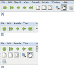
An example of the latter is shown in the three-part Figure 2.22. Part (a) shows
the menu bar and toolbar in their optimal layout. If the window's width is reduced
significantly, the bars are clipped at the right side, as shown in part (b), and “expan-
sion” buttons labeled "
Figure 2.22: Example of auto-
mated UI layout adaptation in a
Windows application.
" are revealed to provide access to the menus and controls
that had to be hidden. Part (c) shows the result of the use of an expansion button
to reveal the remainder of the toolbar.
A different set of strategies should be considered for scene display when the
viewport's size is restricted. Potential solutions include the following.
• The application can zoom out (scale down) the rendering to make more of
(or all of) the scene fit within the viewport.
• The application can clip the rendering to the viewport's boundaries and
provide an interface supporting panning (scrolling) to access any part of
the scene.
These choices are by no means mutually exclusive, and applications often
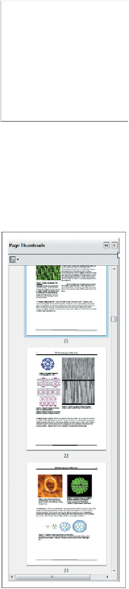
employ a combination of both scaling and clipping; an example, the Adobe Reader
thumbnail pane, is shown in Figure 2.23. In this example, the selected document
is a long PDF document; think of it as a very tall and narrow scene, one stan-
dard page width in width, and 136 standard page heights in height. This applica-
tion uses a different approach for handling height versus width. For the former, it
"clips" the scene and shows only a few pages at a time, providing scrolling fea-
tures for navigation. For the latter, it uses a zoom-out/scale-down strategy to adapt
the scene so that its width exactly matches the width of the pane. The user can
choose to widen the thumbnail pane, thus increasing the thumbnails' width, and
reducing the intensity of the downscaling, making the thumbnail more "readable".
In both of these example adaptations, the application is responsible for the
logic to determine the
policy
to use for a particular form factor/screen size, but the
WPF platform provides much of the
mechanism
needed to implement the policy.
For example, WPF's UI layout tools simplify UI adaptations like the one described
above. And, for scene adaptations, transformations are of great service: Scaling
facilitates zooming in/out, and translation facilitates scrolling/panning effects.
In this chapter we've seen how to create collections of primitives in the abstract
application coordinate system that is our 2D world, and how to reuse primitives as
instances of defined templates. Although we haven't shown templates composed
of simpler templates, we will treat that common form of geometric modeling in
Figure 2.23: Example of auto-
mated scene adaptation in a pop-
ular PDF viewer.