Database Reference
In-Depth Information
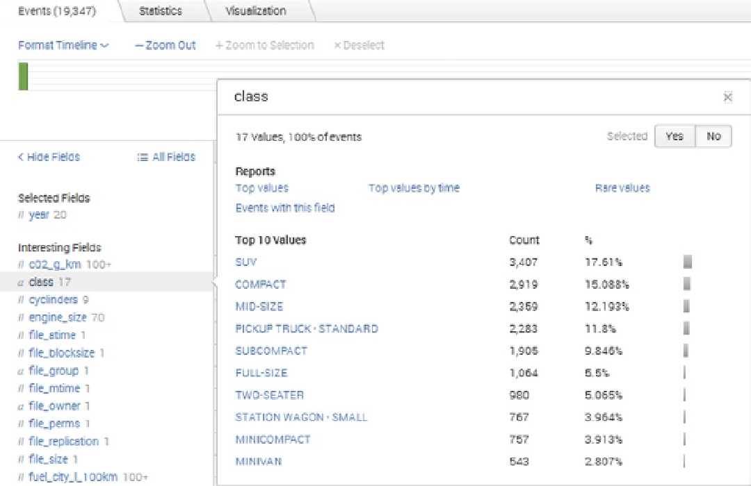
Figure 11-6.
Hunk Field Summary window
By selecting the Year field, and then selecting the Top Values report option in the menu that pops up, I can begin
to build a simple report that will show overall volume in my data by year. The report is created under the Visualization
tab. There, I find drop-down menu options for the report's display, as shown in Figure
11-7
. For example, I can switch
the display from a bar chart, to a single line graph, to a pie chart. There is also an option to change the format for each
display type and an option to change the underlying job settings.
Search WWH ::

Custom Search