Graphics Programs Reference
In-Depth Information
placement. When coloring individual words for emphasis, be sure they are still
readable—and never randomly color individual words or letters unless you intend to
be confusing.
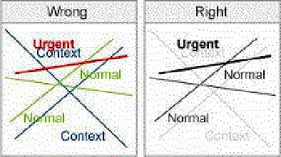
When using color as labels, apply it consistently and deliberately. Remember that
text and symbols in the same or similar colors will appear related, so be sure they
actually are. Define what each color represents and create a color palette for your
design. Important information should be indicated by location, size, and contrast, not
by applying bright colors.
Between 8 and 10 percent of men and approximately 1 percent of women have
some form of color vision deficiency (CVD) or colorblindness. Most have difficulty
distinguishing red from green, and distinguishing those colors from orange-yellow.
Dichromats see only two colors, most commonly blue and orange (plus gray).
People with mild cases of CVD see strong colors but not pastels, and they have
difficulty distinguishing colors that vary only by the addition of red or green, such as
blue and purple, brown and gray, or the many shades of blue-green. People with
CVD, however, have no trouble interpreting luminance—yet another reason to “get it
right in black and white.” Programs such as Vischeck (
www.vischeck.com
) simulate
the common forms of CVD. For example, the following figure illustrates how a
deuteranope would see the colored text above. Unless you know that all your
viewers have normal color vision, be sure your message is intelligible to all.