Graphics Programs Reference
In-Depth Information
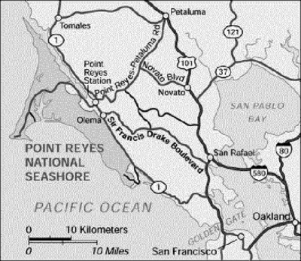
Consider the map in a luminance-only view, created by the Grayscale function in
Adobe Photoshop. All the features are still legible and useful. The roads remain the
dominant visual layer because they contrast strongly with the light gray land. The
difference between Point Reyes and its surrounding ocean is more subtle than it is
in color, but still distinct. It is now easy to see that the text labeling Point Reyes is
darker (higher contrast) than the text labeling the Pacific Ocean, which gives it more
emphasis.
Luminance contrast defines shape and edges, directing our attention and defining
importance. Metrics for text legibility are defined with respect to luminance contrast.
Adding color cannot repair a design that is poorly organized or lacks a clear
information hierarchy. Designers in many fields call the need to focus on contrast
rather than colors “get it right in black and white.”
Do no harm
Edward Tufte, in his classic topic
Envisioning Information
, begins his chapter on
color with the admonition: “Above all, do no harm.” Color used well can enhance and
beautify, but color used poorly can be worse than no color at all.
Beautifully colored but unreadable information is of no use to anyone. You must take
special care when coloring text to maintain sufficient luminance contrast for legibility.
If text is displayed on a background that varies in lightness or color (like all too many
PowerPoint templates suggest), its prominence and legibility will shift with its