Graphics Programs Reference
In-Depth Information
underutilized method of choosing a color scheme and a good way to achieve
harmonious combinations. If you require one or more of the colors to significantly pop
out (to stress a key point in your argument, for example), you may have to adjust the
value or saturation levels.
Complementary colors
Complementary colors are basically opposites, and they sit directly across from each
other on the color wheel. Because they are so different, they tend to work well together.
However, complementary colors are often too strong together, so you may want to adjust
tints, shades, or saturation of one or both hues to achieve a combination that is more
harmonious but still offers good contrast.
Achromatic (+ 1) themes
An achromatic color theme has no hues—only black, white, and shades of gray. But as
we learned from the art of sumi-e, you can achieve a great deal with only black and
white. One advantage of using an achromatic scheme is that you can imagine how an
individual who is colorblind may see your visuals. When using color, it's very important to
make sure there are clear differences in value or saturation, not simply differences in
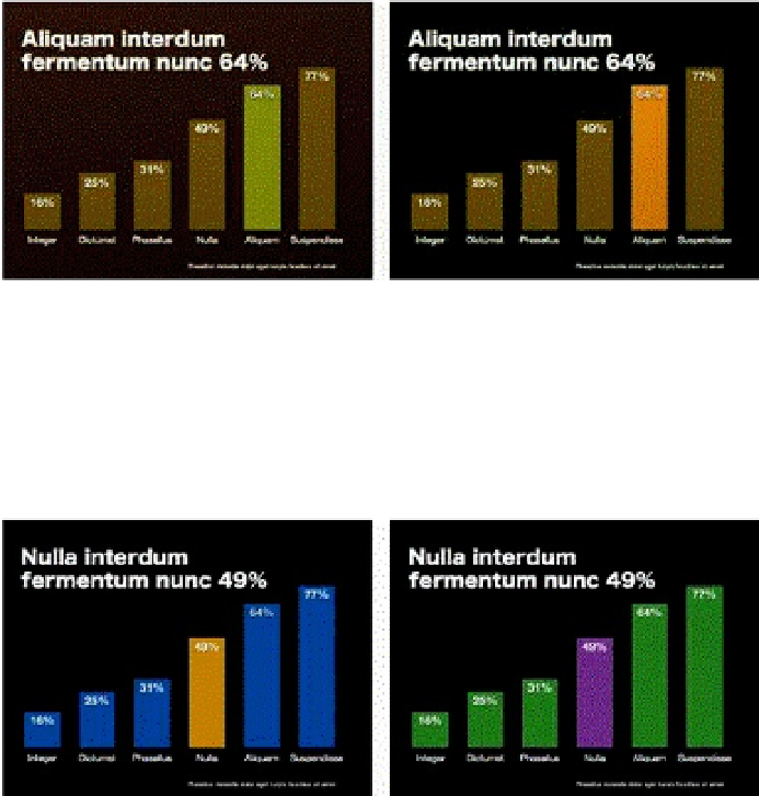
hue. One technique is something I call “achromatic +1,” which simply means that I use an
achromatic theme that includes black-and-white photography or illustrations along with
only one hue. The hue is used for emphasis and may also serve as an element that
repeats and adds unity to the slides.


