Graphics Programs Reference
In-Depth Information
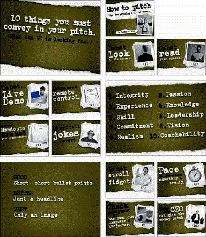
I created these slides for one of my business classes based entirely on a deck that David S. Rose used in his
own seminars. The irregularity of the type is built into the font, giving it a more analog, informal, retro feel.
(Images in slides from
iStockphoto.com
.)
Style Matters
Getting the little things right is what sets professionals apart from amateurs. Since you
know your content and you know what you are talking about, don't let the type on screen
suggest otherwise. If you care enough about getting your point across to your audience
in a professional way, then avoiding common typographic and punctuation errors is
important. Small things such as mispelled words and improper use of quotation marks
instantly make you lose credibility. Learn the basics of proper punctuation and keep your
slides looking neat and error-free.


