Graphics Programs Reference
In-Depth Information
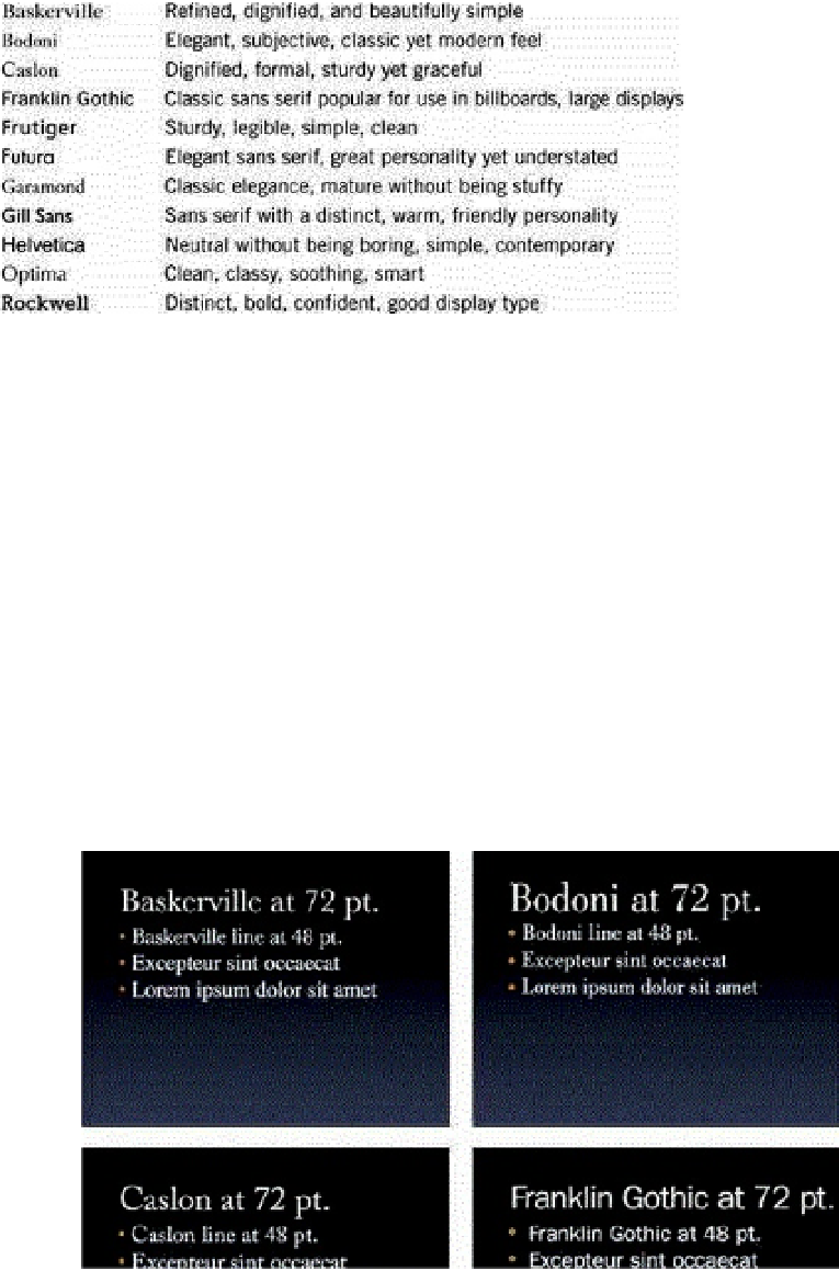
Why do some of these typefaces work so well for presentation design? And how do you
choose among them? Some of the fonts in this list are serif typefaces. Serifs are the
small detail at the ends of strokes within letters. (Letters without those details are called
“sans serif.”) Serif fonts are commonly believed to aid readability for longer sections of
text because the serifs lead your eye from one character and one word to the next. Some
of these fonts, however, are good choices for slide presentations as well. Baskerville,
Bodoni, Caslon, Frutiger, Garamond, and Rockwell all work well for slides. The sans
serif fonts in the list include Franklin Gothic, Frutiger, Futura, Gill Sans, Helvetica, and
Optima.
It's generally accepted that sans serif fonts work better on computer screens as they
lack the counter strokes and thin lines of the serif typefaces that can be hard to read at
low resolutions. Sans serif type grew out of the Germany Bauhaus movement in the early
1900s, influencing type design toward a cleaner, more functional and stripped-down
look. Sans serif became the preferred typeface style for billboards and a great deal of
the signage around us. I recommend sans serif typefaces for use in presentations, too.
Sans serif typefaces look great at large sizes and pop out well on projection screens,
making them extremely legible.