Graphics Programs Reference
In-Depth Information
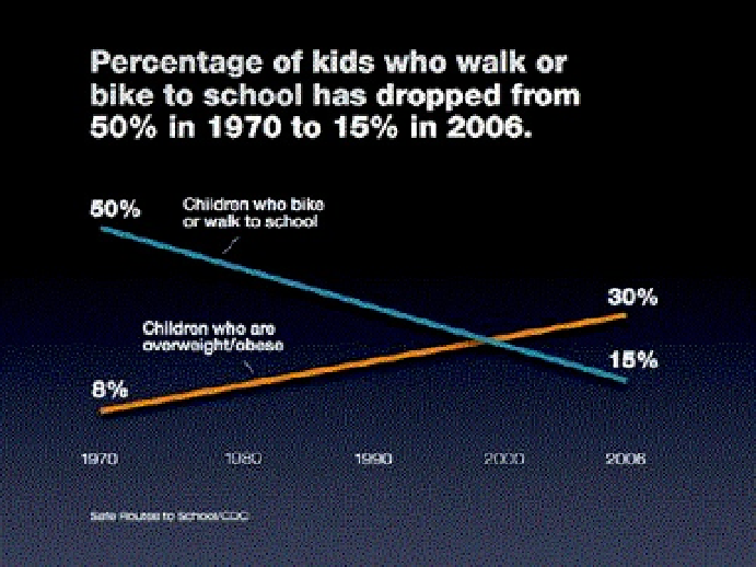
The purpose was to show the general trend only (the presenter filled in the details), but if the specific numbers
for each year are important to show, a table in a handout would work better.
Let the letters breathe
Your software is already doing a pretty good job of automatically adjusting the space
between all the different letter pairs and in the vertical space between lines of type. But
when you make type quite large—which you often do when working with slides—you
need to pay close attention to the spacing in the text to ensure maximum legibility.
When the spacing between pairs of letters in text looks uneven, we need to manually
adjust the space using something known in the typography world as
kerning
. Look
carefully at the words in the slide shown here.
Some letter pairs, such as TS, require more space between them than pairs such as
AW. All the gaps between letters should have the same optical space (rather than actual
space). With the same optical space, the edges of some letter pairs overlap—such as
AW and WA—and other letter pairs will not overlap—such as AL and WK.