Graphics Programs Reference
In-Depth Information
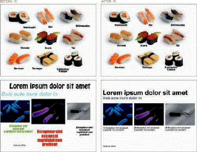
The slides in the right column do a much better job of connecting the elements. It must always be clear what
belongs together and what does not. For example, it should be very easy to tell which image the type is meant
to align with in a design. (Images in slides from
iStockphoto.com
.)
Using a Grid to Provide Structure
A grid provides an invisible structure for placing and connecting elements that produces
better clarity and connectedness. When a grid works well, elements within a design feel
like they are part of a whole—that they belong together. Using a grid helps us build a
clear, simple hierarchy among elements.
Using a grid, however, does not mean that the design becomes rigid or boring. You still
have the freedom to be creative and original within the arrangement. Sometimes, the
greatest source of creative solutions comes only when we have a structure within which
to work. Jazz, for example, may seem like a free-for-all of creative expression without
boundaries to those who are unfamiliar with it. But in fact, there are rules and structure
and boundaries that are “invisible” to the listener, but provide a liberating kind of “grid”
for the musicians to communicate and express themselves. The end result is a whole
(the music) that is greater than the sum of the notes played by the individual players.
Using a grid in presentation design is a bit like this. It's the simple grid underneath—and
implied on top—that gives us greater ease of arrangement and ultimately more freedom
to experiment with the elements that comprise our messages. The unity that is created
makes for clear, harmonious designs.


