Graphics Programs Reference
In-Depth Information
many typefaces the number 8 and the capital S are usually a little fatter on the bottom.
It's easy to see when something is just slightly off vertical center. Use the grids/rulers in your slideware to get
the vertical center perfect (assuming that is your intention).
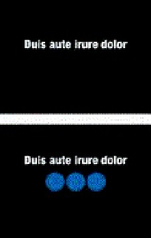
The elements in the two slides above are aligned with the center horizontal axis, but seem just a bit too low.
Here greater visual weight is placed below the elements, resulting in a more balanced feel.
Mind the edges


