Graphics Programs Reference
In-Depth Information
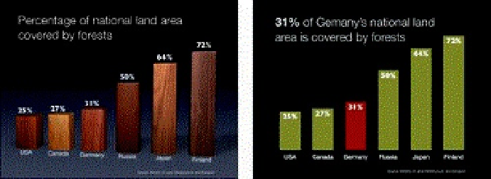
The 3-D effect does not look too bad in this case—at least the wood texture has some relation to the content.
But as a general rule, avoid 3-D effects as they distort the data.
Three principles for presenting data
The kinds of graphs you use in a presentation depend on your unique situation and
objectives. The only rule concerning the display of data—besides telling the truth—is
simplicity. You can achieve simplicity in the design of effective charts, graphs, and tables
by remembering three fundamental principles: restrain, reduce, emphasize.
Restrain
The hardest thing to do is edit yourself—to stop adding more. It's up to you to make the
tough decisions about what to include and what to leave out. Most presenters include too
much information in a display. Charts and graphs can be hard enough for the audience
to see, so we should be careful not to make it more difficult for them by adding
superfluous elements that do more harm than good.
Clutter such as footers, logos, and decorative items obviously create noise. Including too
much data—more than is necessary to make your point—can produce noise as well.
Your job is to include as much as necessary, but no more. Success fundamentally
depends on making good decisions about what to leave in and what to leave out, and
this requires you to exercise restraint. Including deep levels of quantitative detail may be
inappropriate for projection on a screen, which has relatively low resolution. You might,
instead, include detailed data in a handout.