Java Reference
In-Depth Information
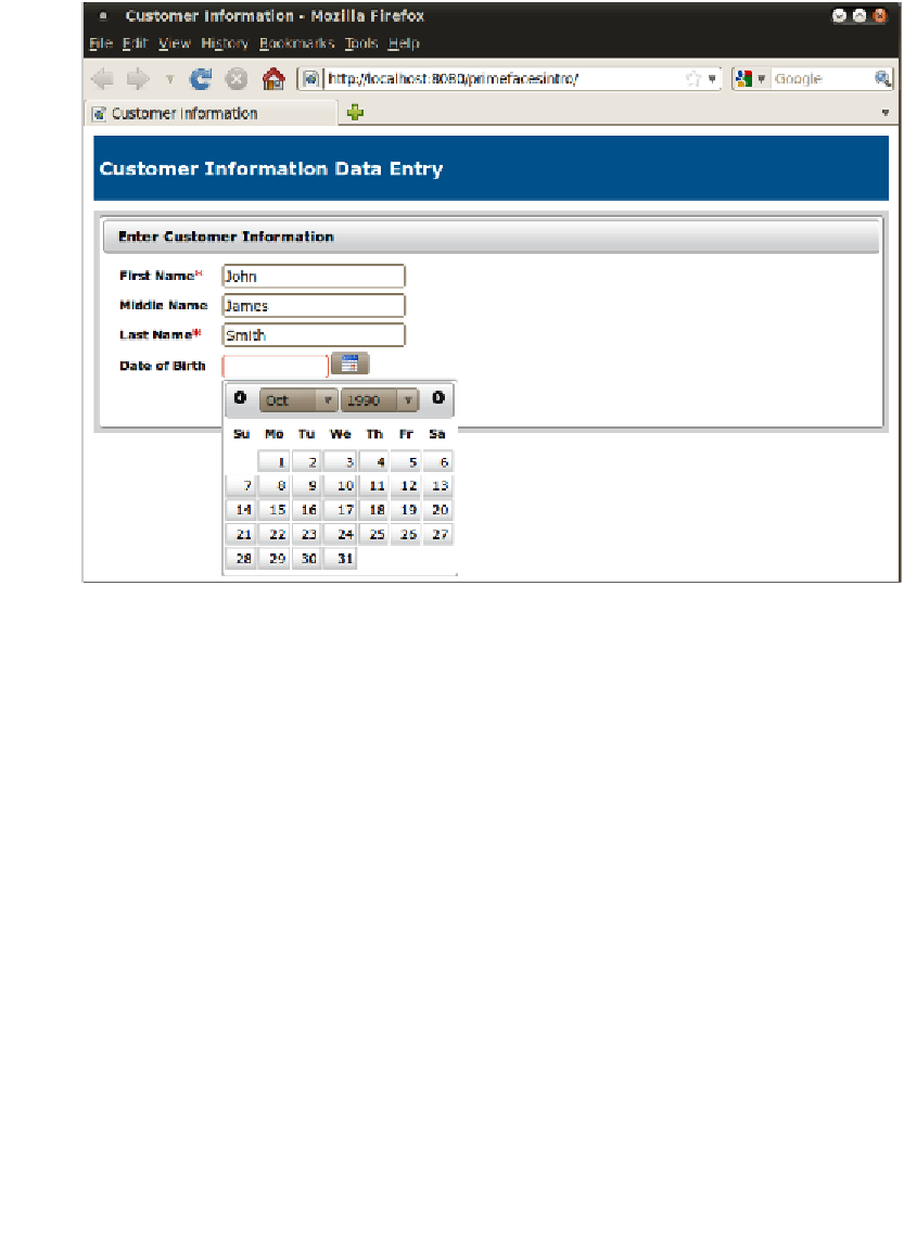
The other new PrimeFaces component we see in this example is
<p:calendar>
. This
calendar can be used for date input fields. When the user clicks on the icon generated
by this component, a nice calendar widget pops up, where the user can select the
date to enter by pointing and clicking.
The PrimeFaces calendar component is very customizable. By default, it renders as a
text field, and when the user clicks on this text field, the calendar widget pops up. In
our example, we set the
showOn
attribute to
button
, this has the effect of rendering
a calendar icon next to the text field, which gives a visual indication that this is a
special field, and also allows users to enter dates manually if they prefer to do so.
By default, the month and year dropdowns are not rendered, this makes it
cumbersome to enter dates that are far in the future or in the past (default day is
always the present date). To get around this, we can set the
navigator
property to
true
like we did in our example.
Additionally, we can control the appearance of the text input field generated by
using the
inputStyle
or
inputStyleClass
attributes of
<p:calendar>
. The
inputStyle
attribute value must be a valid inline CSS, where the value of the
inputStyleClass
attribute must be the name of a CSS class defined in one of our
CSS
stylesheets
.