Information Technology Reference
In-Depth Information
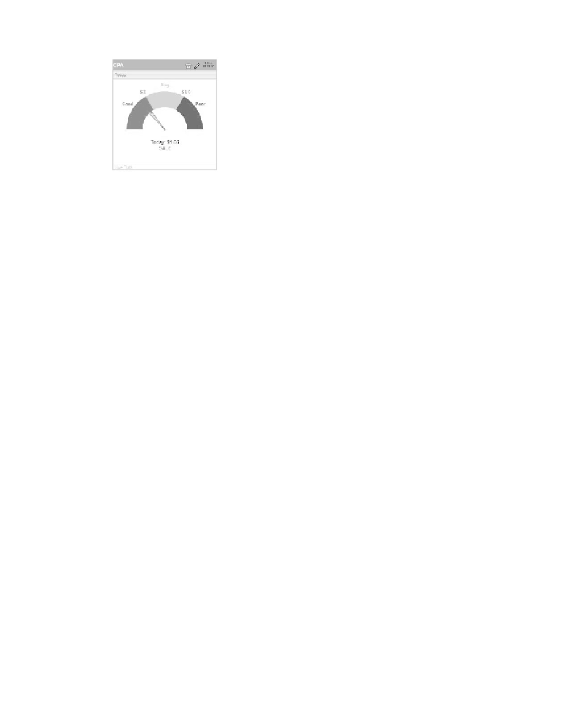
Figure 9.28
The gauge dashboard
Item with reverse success visualization
it's time for me to provide you with my personal warning about gauges: i find
them less than optimal, to put it mildly. Don't get me wrong; they look great and add
a lot of authenticity and color to the dashboard, but when you think about it, are they
really the best way to present a conversion rate?
Most of the time, a conversion rate is much better displayed as a single KPi
number instead of wasting a whole dashboard item on one KPi. Furthermore, if you
have three conversion rates you would like to compare, comparing values across gauges
becomes very difficult. so i suggest you avoid gauges unless somebody who pays your
salary demands them.
242
Goal Charts
a goal chart displays KPis with accumulating data such as visits, page views, actions,
and revenue. Use goal displays when you have a clear goal for your KPi and you want
to track progress toward your target. You should not use a goal chart for a conversion
rate, a bounce rate, or anything else that does not progress and accumulate toward a
goal.
The goal chart holds the same characteristics as the KPi box since you can apply
multiple items to the same box.
When setting up a new goal, as you can see in Figure 9.29, you have to choose
whether to create a complete new goal dashboard item box or apply your new goal to
an existing box. Then you have to enter the metric, period, and most important, a tar-
get for your goal, which Yahoo! calls the limit.
The results of the choices in Figure 9.29 are presented in Figure 9.30.
notice that the numbers presented on top of the goal are not the usual sorted
set. They represent the following values:
T
•
he start value, which is always 0
K
•
Pi, which is the current value of the KPi
•
T
he goal (limit), which is the number you specified when you created the item