Information Technology Reference
In-Depth Information
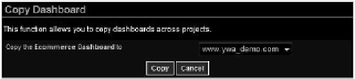
Figure 9.7
Copying dashboards across projects
Depending on your account type, you can create up to 10 different dashboards.
The difficult parts are choosing the right KPis, choosing the right time periods, choos-
ing the right visualization, and creating a unique departmental dashboard. The next
section focuses on adding new dashboard items.
Adding New Dashboard Items
now that you know how to set up and manage a blank dashboard, let's move on to the
juicy part: adding dashboard items. You have two important tasks:
C
•
hoosing
which
data to visualize (including context)
D
229
•
eciding
how
it should be visualized
Data should be any of the metrics or dimensions you already collected.
an example of viewing the data is comparing revenue from paid search to rev-
enue from email advertising for the last 30 days running, displayed as a trend graph.
Yahoo! Web analytics is the best of the three free tools when it comes to
dashboard management. Yahoo! does limit the metrics and dimensions you can add
depending on the chosen visualization. This might seem like a limitation, but you can
view it as a polite education on which metrics and dimensions go best with which visu-
alizations. i agree with most of the choices they have made.
When you start adding dashboard items, you might quickly come to the point
where you simply aren't able to display all the information on a single screen. This is
a problem with Yahoo!'s approach: Yahoo! uses only about 50 percent of screen real
estate for data presentation, which means that it wastes half the potential data visual-
ization space on items such as the logo, the top menu, the left menu, and other naviga-
tional fluff.
on a positive note, Yahoo! does allow users to remove the left menu by clicking
the hide button. That does not change the data/ink ratio, as dashboard items are not
resized to use the extra space, though.
Data-Ink Ratio
The data/ink ratio is the proportion of ink (or pixels, when displaying information on a screen) used
to present actual data, without redundancy, compared to the total amount of ink (or pixels)
used in the entire display, such as in a table or graph. The goal is to design a display that has the
highest possible data-ink ratio.