Graphics Reference
In-Depth Information
ence. Some are more interested in her packaging, others in the transaction websites,
others in seeing a balance. As Keramat says, “Your pages must be practical, easy to
update or add. I shift my focus from case to case. I change my Keynote presentation
every time—no one ever gets it all.”
Her scheme also works for a critical version of the laptop portfolio. Each time a
recruiter or corporate hiring manager asks for a taste of her portfolio to show around
before her presentation, she sends an 11-page PDF with a cover page identifying it as
“Extracts” from the portfolio. She wants to whet their appetite, not steal the show
from herself.
Navigation and architecture
The online portfolio is the latest addition to Keramat's arsenal. Although every-
thing she designs has elements of her two grouping themes, they are not an explicit
element online. This is not an omission. It is a smart acknowledgement that the online
portfolio has a different purpose.
Since she can't show most of it there, her work itself doesn't affect the naviga-
tion directly. Instead, her site content is organized under four active verbs: read, look,
network, and contact. Read provides highlights from her career: awards, client list,
working process. Look provides a peephole tease of her work while identifying its
scope and breadth—everything from the formality of stocks to entertainment packag-
ing in leopard skin. Network connects her site, and interested visitors, to her assertive
footprint in the virtual world. Contact is a straightforward mailto address.
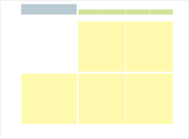
This grid is the schematic for
different types of site pages.
Information is color coded.
Besides the content itself, in
yellow, navigation areas are
in green, while persistent
elements—name, contact
info, and footer—are globals
that will appear unchanged
on each page.