Graphics Reference
In-Depth Information
Group
Some people skip this stage, thereby dooming their design process. Their
unhappy sites list every artifact—brochure, political poster, web banner, annual
report—without organization, hierarchy, or criteria. Other sites have an inappropriate
grouping scheme that seems selected by dartboard—alphabetical, for example. Or the
main group types are mixed. Mixing creates a haphazard experience and makes it hard
for people to see the work that's relevant to them.
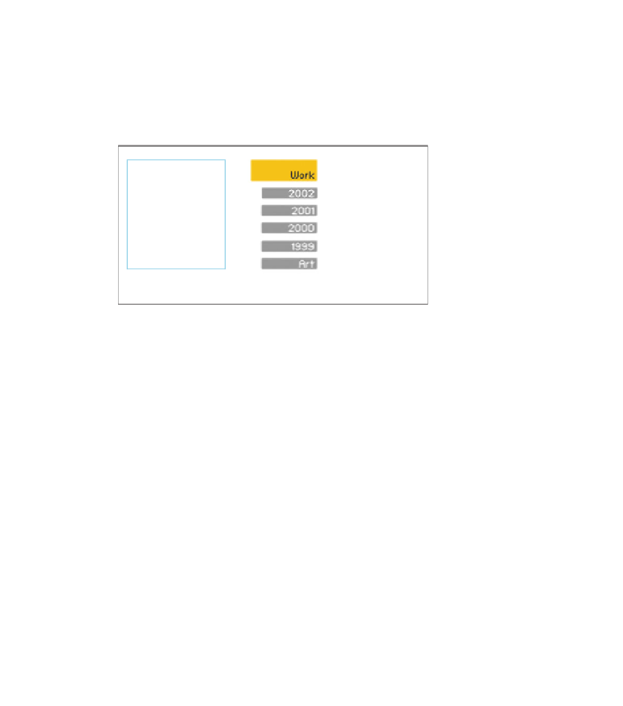
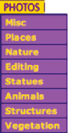
These examples of poor
grouping choices have been
pulled from online.
Moving left to right, the first
mixes category and discipline
(collateral and photography).
The second mixes date with
discipline, as well as auto-
matically time stamping the
website. The third equates
image editing with
photography topics.
But for every bad portfolio grouping scheme, there are many good alternatives.
You might find yours by returning to the way you've organized your work after reading
Chapter 5, “Organizing Your Work.” If the way you've organized your archive feels nat-
ural, it might be the best choice for your portfolio interface.
If your archive's organization doesn't feel right for the work you'll use in the
portfolio, here are a few grouping scheme ideas to get you started:
• Date/employment history
• Discipline/area (design, illustration, photo)
• Category (collateral, packaging, editorial)
• Technology (print, interactive, moving image)
• Medium (traditional, computer, 2D, 3D)
• Process (sketches, modeling, character animation)
• Client
• Client industry/market
• Difficulty/size of project
• Visual interest