Graphics Reference
In-Depth Information
Navigation and architecture
Technology can affect navigation choices, usually by presenting limitations to
creativity. One can see Bennett's command of his medium in the apparent ease with
which he provides navigational feedback and options that most developers would
avoid, or never even think of attempting.
In one of its most elegant uses of technology, Bennett's site readily adapts
itself to the viewer's screen size. Most Flash websites are designed at an optimum
aspect ratio and size. If you enlarge the browser window, you simply get a lot more of
the designer's background. If you shrink the window down, eventually you have to
scroll to see the entire page. Bennett's site scales; if you have a cinema screen, you
can see his artwork at its largest size. But if you're on a 13-inch laptop, the naviga-
tion tools adjust to the browser window, maintaining their relationship to the image
window and always remaining accessible.
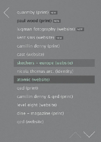
The menu and header provide a wealth
of orientation information. The header
reminds you of the main section you're
in, the project name and type, and how
many images represent the project.
The main menu has two large arrows that
point back to the main heads and down to
indicate that there are more projects
below the ones you can see listed.
Unvisited projects are in light type, visited
ones are in dark. The selected project has
blue type in a dark box. Hover over
another project and it highlights with a
mid-value box.