Graphics Reference
In-Depth Information
Solution
# Convert the sunspot.year data set into a data frame for this example
sunspotyear
<-
data.frame(
Year
=
as.numeric(time(sunspot.year)),
Sunspots
=
as.numeric(sunspot.year)
)
ggplot(sunspotyear, aes(x
=
Year, y
=
Sunspots))
+
geom_area()
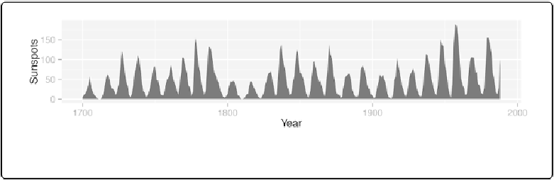
Figure 4-17. Graph with a shaded area
Discussion
By default, the area will be filled with a very dark grey and will have no outline. The color can
be changed by setting
fill
. In the following example, we'll set it to
"blue"
, and we'll also make
it 80% transparent by setting
alpha
to 0.2. This makes it possible to see the grid lines through
ggplot(sunspotyear, aes(x
=
Year, y
=
Sunspots))
+
geom_area(colour
=
"black"
, fill
=
"blue"
, alpha
=
.2
)