Graphics Reference
In-Depth Information
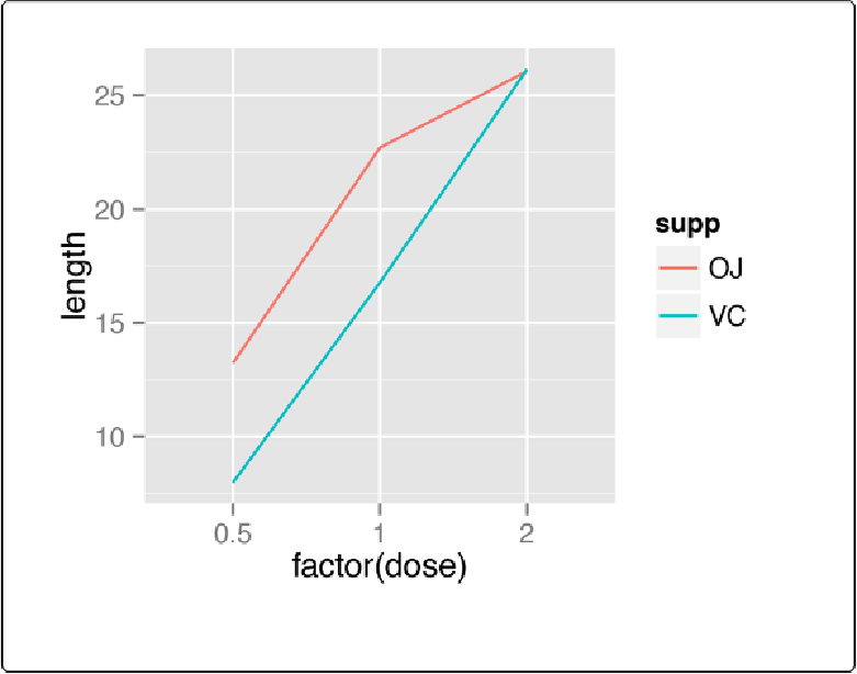
Figure 4-7. Line graph with continuous x variable converted to a factor
Notice the use of
group=supp
. Without this statement,
ggplot()
won't know how to group the
data together to draw the lines, and it will give an error:
ggplot(tg, aes(x
=
factor(dose), y
=
length, colour
=
supp))
+
geom_line()
geom_path: Each group consists of only one observation. Do you need to adjust the
group aesthetic?
Another common problem when the incorrect grouping is used is that you will see a jagged saw-
tooth pattern, as in
Figure 4-8
:
ggplot(tg, aes(x
=
dose, y
=
length))
+
geom_line()