Graphics Reference
In-Depth Information
Figure A-9. A scatter plot with colors set
We can also modify the scales; that is, the mappings from data to visual attributes. Here, we'll
change the xscale so that it has a larger range:
p
+
geom_point()
+
scale_x_continuous(limits
=
c(
0
,
8
))
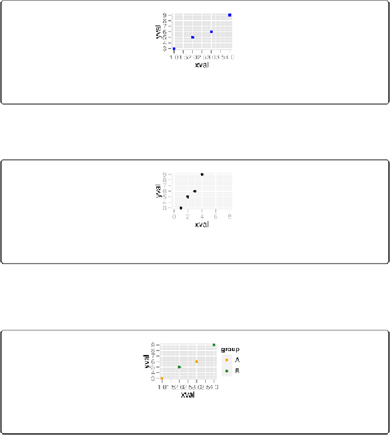
Figure A-10. A scatter plot with increased x-range
If we go back to the example with the
colour=group
mapping, we can also modify the color
scale:
p
+
geom_point()
+
scale_colour_manual(values
=
c(
"orange"
,
"forestgreen"
))
Figure A-11. A scatter plot with modified colors and a different palette
Both times when we modified the scale, the guidealso changed. With the xscale, the guide was
the markings along the x-axis. With the color scale, the guide was the legend.