Graphics Reference
In-Depth Information
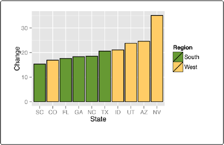
Figure 3-10. Graph with different colors, black outlines, and sorted by percentage change
This example also uses the
reorder()
function, as in this particular case it makes sense to sort
the bars by their height, instead of in alphabetical order.
See Also
For more about using the
reorder()
function to reorder the levels of a factor based on the val-
ues of another variable, see
Changing the Order of Factor Levels Based on Data Values
.
For more information about using colors, see
Chapter 12
.
Coloring Negative and Positive Bars Differently
Problem
You want to use different colors for negative and positive-valued bars.
Solution
We'll use a subset of the
climate
data and create a new column called
pos
, which indicates
whether the value is positive or negative: