Graphics Reference
In-Depth Information
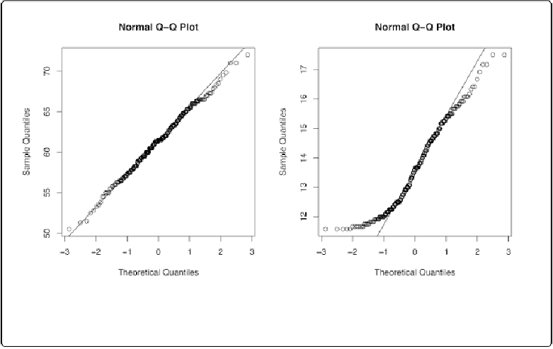
Figure 13-25. Left: QQ plot of height, which is close to normally distributed; right: QQ plot of age,
which is not normally distributed
Discussion
The points for
heightIn
are close to the line, which means that the distribution is close to nor-
mal. In contrast, the points for
ageYear
veer far away from the line, especially on the left, indic-
ating that the distribution is skewed. A histogram may also be useful for exploring how the data
is distributed.
See Also
See
?qqplot
for information on comparing data to theoretical distributions other than the nor-
mal distribution.
ggplot2 has a
stat_qq()
function, but it doesn't provide an easy way to draw the QQ line.