Graphics Reference
In-Depth Information
# The existing 'speed' column includes the z component. We'll calculate
# speedxy, the horizontal speed.
islicesub$speedxy
<-
sqrt(islicesub$vx
^
2
+
islicesub$vy
^
2
)
# Map speed to alpha
ggplot(islicesub, aes(x
=
x, y
=
y))
+
geom_segment(aes(xend
=
x
+
vx
/
50
, yend
=
y
+
vy
/
50
, alpha
=
speed),
arrow
=
arrow(length
=
unit(
0.1
,
"cm"
)), size
=
0.6
)
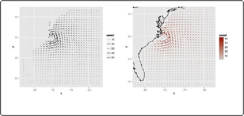
Next, we'll map
speed
to
colour
. We'll also add a map of the United States and zoom in on the
area of interest, as shown in the graph on the right in
Figure 13-23
, using
coord_cartesian()
(without this, the entire USA will be displayed):
# Get USA map data
usa
<-
map_data(
"usa"
)
# Map speed to colour, and set go from "grey80" to "darkred"
ggplot(islicesub, aes(x
=
x, y
=
y))
+
geom_segment(aes(xend
=
x
+
vx
/
50
, yend
=
y
+
vy
/
50
, colour
=
speed),
arrow
=
arrow(length
=
unit(
0.1
,
"cm"
)), size
=
0.6
)
+
scale_colour_continuous(low
=
"grey80"
, high
=
"darkred"
)
+
geom_path(aes(x
=
long, y
=
lat, group
=
group), data
=
usa)
+
coord_cartesian(xlim
=
range(islicesub$x), ylim
=
range(islicesub$y))
Figure 13-23. Left: vector field with speed mapped to alpha; right: with speed mapped to colour
The
isabel
data set has three-dimensional data, so we can also make a faceted graph of the
data, as shown in
Figure 13-24
. Because each facet is small, we will use a sparser subset than
before: