Graphics Reference
In-Depth Information
# Using geom_raster() - looks the same, but a little more efficient
p
+
geom_raster()
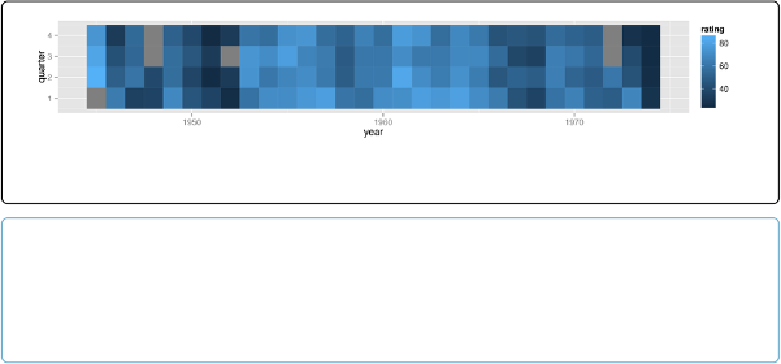
Figure 13-12. A heat map—the grey squares represent NAs in the data
NOTE
The results with
geom_tile()
and
geom_raster()
shouldlook the same, but in practice they might
appear different. See
Making a Density Plot of Two-Dimensional Data
for more information about this
issue.