Graphics Reference
In-Depth Information
# Put in a data frame and recalculate valence
cbi
<-
data.frame(Year
=
interp$x, Anomaly10y
=
interp$y)
cbi$valence[cbi$Anomaly10y
>=
0
]
<-
"pos"
cbi$valence[cbi$Anomaly10y
<
0
]
<-
"neg"
It would be more precise (and more complicated) to interpolate exactly where the line crosses
zero, but
approx()
works fine for the purposes here.
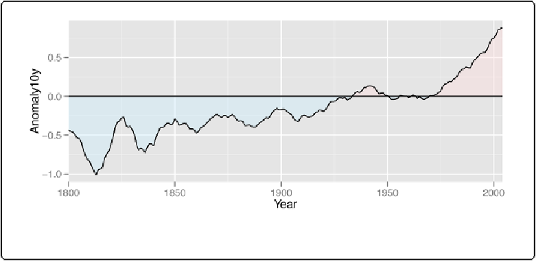
Now we can plot the interpolated data (
Figure 12-14
). This time we'll make a few adjust-
ments—we'll make the shaded regions partially transparent, change the colors, remove the le-
gend, and remove the padding on the left and right sides:
ggplot(cbi, aes(x
=
Year, y
=
Anomaly10y))
+
geom_area(aes(fill
=
valence), alpha
=
.4
)
+
geom_line()
+
geom_hline(yintercept
=
0
)
+
scale_fill_manual(values
=
c(
"#CCEEFF"
,
"#FFDDDD"
), guide
=
FALSE
FALSE
)
+
scale_x_continuous(expand
=
c(
0
,
0
))
Figure 12-14. Shaded regions with interpolated data