Graphics Reference
In-Depth Information
7
19.8
# Time is numeric (continuous)
str(BOD)
'data.frame'
:
6
obs. of
2
variables:
$ Time : num
1 2 3 4 5 7
$ demand: num
8.3 10.3 19 16 15.6 19.8
-
attr(
*
,
"reference"
)
=
chr
"A1.4, p. 270"
ggplot(BOD, aes(x
=
Time, y
=
demand))
+
geom_bar(stat
=
"identity"
)
# Convert Time to a discrete (categorical) variable with factor()
ggplot(BOD, aes(x
=
factor(Time), y
=
demand))
+
geom_bar(stat
=
"identity"
)
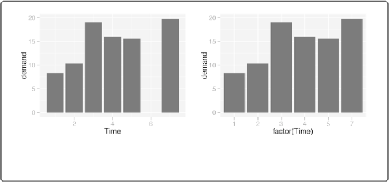
Figure 3-2. Left: bar graph of values (with stat="identity") with a continuous x-axis; right: with x
variable converted to a factor (notice that the space for 6 is gone)
In these examples, the data has a column for
x
values and another for
y
values. If you instead
want the height of the bars to represent the countof cases in each group, see
Making a Bar Graph
By default, bar graphs use a very dark grey for the bars. To use a color fill, use
fill
. Also, by
default, there is no outline around the fill. To add an outline, use
colour
. For
Figure 3-3
, we use
a light blue fill and a black outline:
ggplot(pg_mean, aes(x
=
group, y
=
weight))
+
geom_bar(stat
=
"identity"
, fill
=
"lightblue"
, colour
=
"black"
)