Graphics Reference
In-Depth Information
Simply pass the table to
barplot()
to generate the graph of counts:
# Generate a table of counts
barplot(table(mtcars$cyl))
graph of values, use
geom="bar"
and
stat="identity"
. Notice the difference in the output
when the xvariable is continuous and when it is discrete:
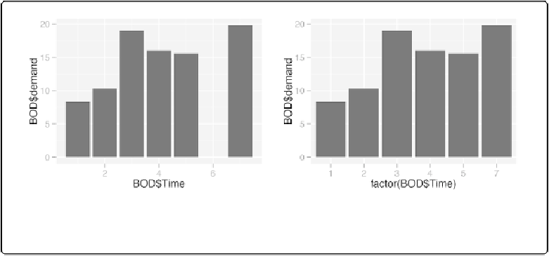
library(ggplot2)
qplot(BOD$Time, BOD$demand, geom
=
"bar"
, stat
=
"identity"
)
# Convert the x variable to a factor, so that it is treated as discrete
qplot(factor(BOD$Time), BOD$demand, geom
=
"bar"
, stat
=
"identity"
)
Figure 2-6. Left: bar graph of values with qplot() with continuous x variable; right: with x variable
converted to a factor (notice that there is no entry for 6)
qplot()
can also be used to graph the countsin each category (
Figure 2-7
). This is in fact the
default way that ggplot2 creates bar graphs, and requires less typing than a bar graph of values.
Once again, notice the difference between a continuous x-axis and a discrete one.
# cyl is continuous here
qplot(mtcars$cyl)
# Treat cyl as discrete
qplot(factor(mtcars$cyl))