Graphics Reference
In-Depth Information
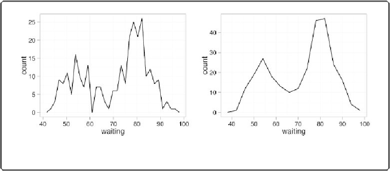
Making a Frequency Polygon
Problem
You want to make a frequency polygon.
Solution
ggplot(faithful, aes(x
=
waiting))
+
geom_freqpoly()
Figure 6-14. Left: a frequency polygon; right: with wider bins
Discussion
A frequency polygon appears similar to a kernel density estimate curve, but it shows the same
information as a histogram. That is, like a histogram, it shows what is in the data, whereas a
kernel density estimate is just that—an estimate—and requires you to pick some value for the
bandwidth.
Also like a histogram, you can control the bin width for the frequency polygon (
Figure 6-14
,
right):
ggplot(faithful, aes(x
=
waiting))
+
geom_freqpoly(binwidth
=
4
)
Or, instead of setting the width of each bin directly, you can divide the xrange into a particular
number of bins: