Graphics Reference
In-Depth Information
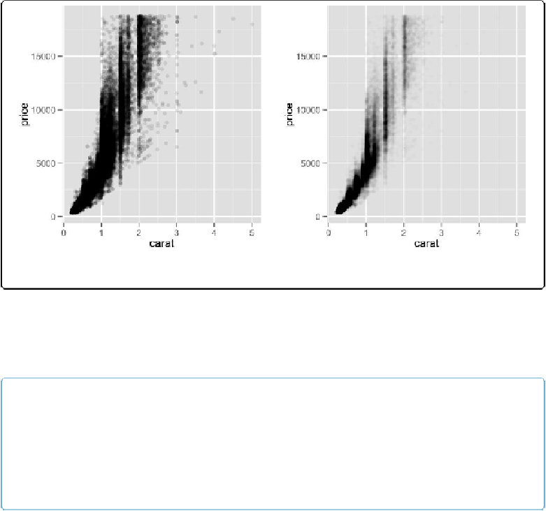
Figure 5-13. Left: semitransparent points with alpha=.1; right: with alpha=.01
Now we can see that there are vertical bands at nice round values of
carats
, indicating that dia-
monds tend to be cut to those sizes. Still, the data is so dense that even when the points are 99%
transparent, much of the graph appears solid black, and the data distribution is still somewhat
obscured.
NOTE
For most graphs, vector formats (such as PDF, EPS, and SVG) result in smaller output files than bitmap
formats (such as TIFF and PNG). But in cases where there are tens of thousands of points, vector output
files can be very large and slow to render—the scatter plot here with 99% transparent points is 1.5 MB!
In these cases, high-resolution bitmaps will be smaller and faster to display on computer screens. See
Chapter 14
for more information.
Another solution is to binthe points into rectangles and map the density of the points to the
fill color of the rectangles, as shown in
Figure 5-14
. With the binned visualization, the vertical
bands are barely visible. The density of points in the lower-left corner is much greater, which
tells us that the vast majority of diamonds are small and inexpensive.
By default,
stat_bin_2d()
divides the space into 30 groups in the xand ydirections, for a total
of 900 bins. In the second version, we increase the number of bins with
bins=50
.
The default colors are somewhat difficult to distinguish because they don't vary much in lumin-
osity. In the second version we set the colors by using
scale_fill_gradient()
and specifying