Graphics Reference
In-Depth Information
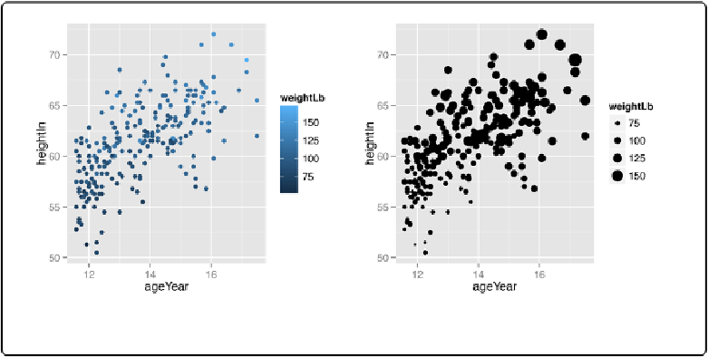
Figure 5-9. Left: a continuous variable mapped to colour; right: mapped to size
Discussion
A basic scatter plot shows the relationship between two continuous variables: one mapped to the
x-axis, and one to the y-axis. When there are more than two continuous variables, they must be
mapped to other aesthetics: size and/or color.
We can easily perceive small differences in spatial position, so we can interpret the variables
mapped to xand ycoordinates with high accuracy. We aren't very good at perceiving small dif-
ferences in size and color, though, so we will interpret variables mapped to these aesthetic attrib-
utes with a much lower accuracy. When you map a variable to one of these properties, it should
be one where accuracy is not very important for interpretation.
When a variable is mapped to
size
, the results can be perceptually misleading. The largest dots
in
Figure 5-9
have about 36 times the area of the smallest ones, but they represent only about 3.5
times the weight. If it is important for the sizes to proportionally represent the quantities, you can
change the range of sizes. By default the sizes of points go from 1 to 6 mm. You could reduce
the range to, say, 2 to 5 mm, with
scale_size_continuous(range=c(2, 5))
. However, the
point size numbers don't map linearly to diameter or area, so this still won't give a very accurate
representation of the values. (See
Creating a Balloon Plot
for details on making the area of dots
proportional to the value.)
When it comes to color, there are actually two aesthetic attributes that can be used:
colour
and
fill
. For most point shapes, you use
colour
. However, shapes 21-25 have an outline with a
solid region in the middle where the color is controlled by
fill
. These outlined shapes can be