Graphics Programs Reference
In-Depth Information
There are four Color Options settings you can adjust:
Brightness
High brightness decreases the amount of black in the colors,
making the view look like an overexposed photograph. Low brightness does the
opposite, making the model appear as though it is being viewed on an overcast
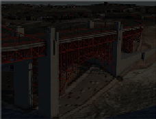
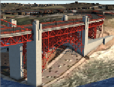
day or just after sunset. The values on the Brightness slider go from 0 to 100. In
the following images, Brightness is set to 10 in the left image, 50 in the center
image, and 90 in the right image. 50 is the suggested value.
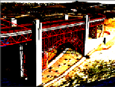
Contrast
Increased contrast causes the lighter tones to get lighter and the
darker tones to get darker. Too much contrast can cause the model to look
“cartoonish,” and too little can cause it to look flat or dull. The values on the
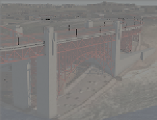
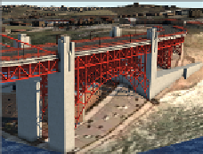
Contrast slider go from 0 to 100. In the following images, Contrast is set to 10 in
the left image, 50 in the center image, and 90 in the right image. 50 is the sug-
gested value.
Light Intensity
Increasing the light intensity causes lit areas to become
brighter and shadows to become darker. This is a slightly different effect than what
you will observe when changing the brightness. The values on the Light Intensity
slider go from 0 to 11. In the following images, Light Intensity is set to 0 in the left
image, 1 in the center image, and 8 in the right image. 1 is the suggested value.


Search WWH ::

Custom Search