HTML and CSS Reference
In-Depth Information
Getting Organized
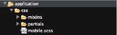
Let's begin by creating the relevant folders within the application folder. In the
CSS folder within your application folder, create two folders called mixins and
partials and a new sass file in the CSS folder called mobile.scss. Your folder
structure should look similar to Figure 6-1 below.
Figure 6-1.
CSS Folder Structure
This folder structure will allow you to separate your CSS for forms, layout and
typography into separate SASS files. The mobile.scss file is simply a master
SASS file that will pull in all of the partials. This means that if you wanted to
create a stylesheet for older mobile devices with just typography, you can create
a new master SASS file and pull in just the typography SASS file and not have to
duplicate any CSS.
Open the mobile.scss file and add the following SASS code:
@import 'mixins/animations';
@import 'mixins/gradient';
@import 'mixins/box-sizing';
@import 'partials/reset';
@import 'partials/typography';
@import 'partials/layout';
@import 'partials/forms';
@media only screen and (-webkit-min-device-pixel-ratio : 1.5),
only screen and (min-device-pixel-ratio : 1.5) {
@import 'partials/highres';
}
As shown in Chapter 5, this will import the appropriate SASS files when the
SASS file is compiled.
You will also notice that there is a media query in the code above. This media
query will allow you to pull in high-resolution graphics for high resoloution
devices. Within the media query, you can see that rather than explicitly adding
CSS, a highres partial is imported. This helps to prevent any CSS from being
added to the master mobile.scss file. The mobile.scss file should simply be seen
as a SASS file used to bring everything together and idealy should only contain
media queries and imports.