HTML and CSS Reference
In-Depth Information
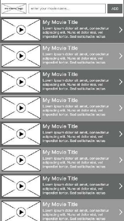
Figure 4-6 presents the information in the same way, but for a smaller screen;
however, the list items are slightly larger to accommodate for the user's
situation in which finger-tapping accuracy might be low. Although the list items
are bunched together, the target that the user has to tap to view more
information about a movie is reasonably large. Placing the taskbar at the top
also allows a user to thumb through their list of saved movies naturally and with
ease, and not worry so much about accidentally activating another part of the
application. Both UI mock-ups for the application are the same in terms of
HTML; however, we can use CSS media queries to target specific display sizes
and orientations. You can also utilize a fluid layout to ensure the application
reacts correctly to changes in orientation and screen size.
Figure 4-6.
Movie List for portrait mobile