HTML and CSS Reference
In-Depth Information
This top bar is visible on every page within the application. When designing any
mobile-based web site, you should keep in mind that it will be viewed on a
variety of screen sizes in either landscape or portrait mode.
NOTE:
To date, there is no known way to lock the web browser's
orientation to landscape or portrait. So when you design a mobile web
application, you should take into consideration that the orientation will
change.
Creating the Movie List
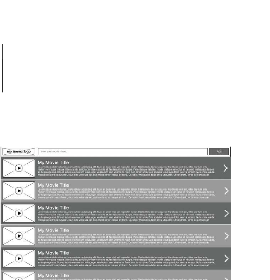
The UI for the MoMemo application revolves around the search bar at the top of
the screen. Figure 4-5 and Figure 4-6 show the Movie List section of the
application, including the taskbar for both tablet and mobile devices.
Figure 4-5.
Movie List for landscape tablet
As you can see from Figure 4-5, the ability to search for and add movies can be
accessed while browsing through movies previously added to the list. It is also
clear to the user that this will add items to the list rather than search through the
existing list, as the button to submit the form is marked as ADD rather than
search.