HTML and CSS Reference
In-Depth Information
Now that we have a clear insight as to how the application should currently
function, we can begin to create the UI.
Creating the UI and HTML
If you have ever developed an app (native or web) for Android specifically, you
will know that some design principles differ from what you may expect from
other mobile operating systems such as iOS or Windows Mobile. For instance,
on the Google Galaxy Nexus and Samsung Galaxy Tab, the system bars
(Navigation Bar and Combined Bar) are found at the bottom of the screen and
are always active or visible when using Android Browser. A good design
principle is not to stack toolbars on top of the system bar; this will prevent users
from inadvertently tapping on system buttons when they actually meant to
interact with your application.
In order to make it easy for the user to use this application, it makes sense to
present a clear way for users to add and view their movies while also providing
the ability for you to add new features in the future.
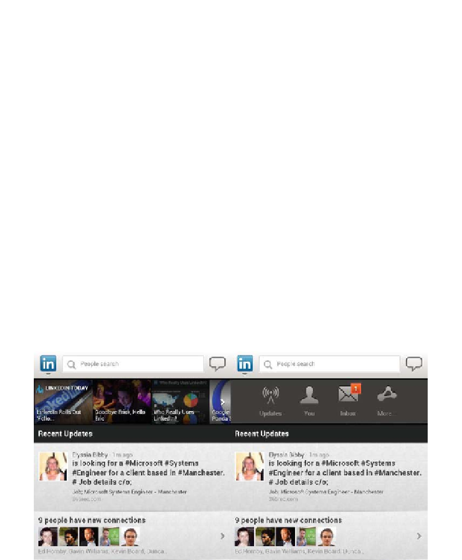
LinkedIn provides a good and clear example of this. As you can see from Figure
4-4, it is clear that the primary use for the mobile web application is to search for
people and see the most recent updates. If you want to access more
functionality, there is a toolbar hidden under the ''in'' icon next to the search bar.
If you want to update your LinkedIn status, you click on the message balloon
icon at the top right.
Figure 4-4.
LinkedIn's solution for an uncluttered landing/home page