Graphics Reference
In-Depth Information
Fig. 10.107
Creaser's final
day-for-night correction.
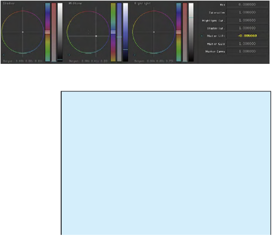
Fig. 10.108
Data for correction in FinalTouch UI.
The Look of the Feature Film
David Mullen, ASC, describes the modern look of feature films. “Most movies nowadays
are on the contrasty side, compared to movies in the past. They tend to be a single-source
look with a lot of fall-off into the shadows, which is nice because it gives the film a cer-
tain three-dimensional quality to it. There's always a technical reason for wanting more
contrast, and that is that it makes things look sharper and more three-dimensional. But
it's mainly a mood issue. It's like asking a cook, 'How much salt should I put in it?' One
of the questions I always get from film students is, 'I'm working with a director and we're
trying to make these scenes look dark and we're not agreeing on what that means.' And
that's partly because it's completely a taste issue. I mean, one thing I tell people is that
you have to define what 'dark' means. Does it mean 'dim,' which can be low contrast
and nothing is at key exposure and everything is fairly murky and low key and soft? Or it
can mean that there's a lot of contrast, where there are small areas of the screen within
the frame at full exposure but there's lots of big areas of the exposure that are black
or near black. A lot of them don't realize that the terms are all vague. I remember once
telling a director that we should shoot the scene in silhouette and he said, 'Oh, that's

Search WWH ::

Custom Search