Graphics Reference
In-Depth Information
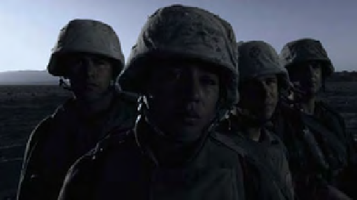
“A little blue always helps for the suggestion of night. But this,” he
says as he points to the sky and the way the matte transitions to the hel-
mets, “is not good.”
This is a real shot that someone would come in and say, 'I want this
to be nighttime.' And whether or not it's easy doesn't matter.
- Pete Jannotta, Filmworkers Club
Instead of being impatient with the mistake, the challenge of the shot
energizes Jannotta. “This is fun. This is a real shot that someone would
come in and say, 'I want this to be nighttime.' And whether or not it's
easy doesn't matter. So it's actually a good exercise.”
I ask Jannotta what things he has to do to create the day-for-night
effect. “Desaturation, all the levels come down, a little blue added. Pretty
much that's it,” Jannotta responds. He starts with desaturation. “I'm just
compressing the bottom and bringing the highlights up a bit. We could
cool those off a bit too. I'm pushing it into the flesh tones. It can get pretty
trite to get really blue, because it just looks hokey. But most everyone sees
blue and dark and they think 'night.' If you go overboard, then it's sad
and sick looking. It could almost be okay to do a little bit of cyan. A little
bit of green/blue is okay, too” (
Figures 10.103
and
10.104
)
.
Fig. 10.103
Jannotta's
primary correction—day-
for-night.
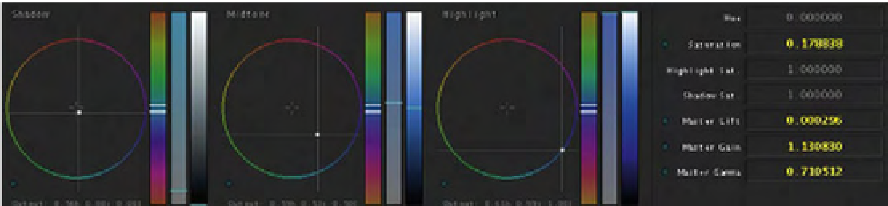
Fig. 10.104
Data for Primary room.
Search WWH ::

Custom Search