Graphics Reference
In-Depth Information
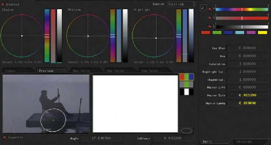
Fig. 10.78
Data from the outside of the vignette.
“He looks like an old guy reminiscing. That's why I went cooler with
it. I think if I'd gone golden, that evokes a different emotion.” I ask if it
wouldn't be hard to get this image to be golden and Matusek seems ready
for the challenge.
Matusek starts off by mentioning that his blacks are close to being
clipped, and I ask how he knows how to stretch a specific tonal range. “If
I wanted to get detail out of the blanket over his legs, bringing the black
up would just make it milky, so riding the lift down and the gamma up
until I'd stretched that little area and get more detail out of it. If this was
shot on video, it'd just be noise.”
Matusek continues, “If I'm going to go golden, I'd probably go a little
more contrasty with it. This is more of a graphic image, so you don't
have to be realistic. You can definitely have some more fun with it. It's
really the color of the water and then the guy and the pier is pretty much
grayscale. There's not much color information. So you can really be more
graphic with it” (
Figures 10.79
and
10.80
)
.
Search WWH ::

Custom Search