Graphics Reference
In-Depth Information
Fig. 10.31
Matusek's primary correction.
Fig. 10.32
Data from Primary room.
Matusek takes some time working on getting a saturated sky before
explaining, “I'm doing what I said I disliked when the clients asked for
it, but I'm putting a little blue in the sky. Usually it works out to look
pretty good.” He creates a big oval window along the top. “I would prefer
it without the blue sky, but a lot of clients would prefer that,” he says,
showing off his newly tweaked sky (
Figures 10.33
and
10.34
)
.
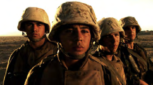
Continuing with the soldier/look theme, Matusek comments on a
recent project of his. “I worked on a documentary called
War Tapes
. They
gave a bunch of cameras to soldiers and they documented their year's stay
in Iraq. So what we did was, all the footage in Iraq, we gave it a higher
contrast, warmer look. We gave it a little grittier look. And then they
would cut from the soldiers to their families. On the home front, it was
a little softer, it was more saturated and had truer colors. Just trying to
create a separation. And it's all subtle. It was a documentary, so the Iraq
footage wasn't like
Blackhawk Down
.

Search WWH ::

Custom Search