Graphics Reference
In-Depth Information
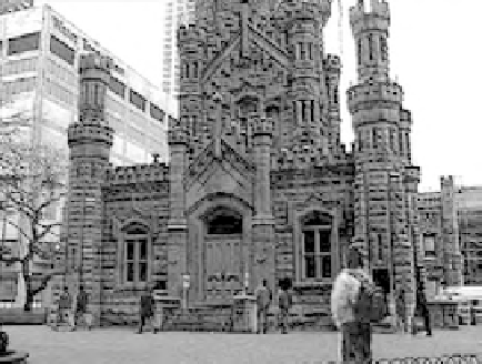
Fig. 9.56
The blue channel of the “base” water tower image.
way blown out, so I will knock the red down and build some of that chan-
nel back with the blue. And the same thing with the green channel. Then
I'll add a little bit more blue back in the mids. Even though the whites and
the blacks end up even, the mids have this little angle to them (slightly
higher reds, mid greens, lower blues). I don't know why, but it just works
out that way.”
Curren switches to the blown-out, poorly white balanced version of
the shot. “Now comes the fun. Once again, I'm just going to get down out
of the high areas first,” Curren explains, pulling the whites down on the
master curve. Now, you can check the channels and it's exactly inverted
from the other one. The green channel is the hot one (
Figure 9.58
) and
the blue channel (
Figure 9.59
).
“I'm going to do the same thing I did on the other one in channels,
only in the opposite direction. Now we know the red channel is the good
one” (
Figure 9.57
)
, he explains as he blends red with the blue and green
channels.
“Still got too much blue,” he states as he goes to the red curve and
pulls the high/mid reds up a bit. “This is one of those cases where you
have to start messing up the other one to get them to match.” He adds a
chroma blur from GenArts' Sapphire plug-ins to better match the differ-
ence in contrast between the two shots.
I ask what the point of the blur was in matching the shots. Curren
explains, “Basically, I used a chroma blur and I went in and blurred ver-
tically because I was seeing all the sharp edges. If we go in and look at
the channels individually, you can see these hard edges in here. But the
blue is not. The blue is a little softer. So I did a vertical blur on the two
channels that were nasty, because the hard edges aren't going that way
[horizontally].”
Search WWH ::

Custom Search