Graphics Reference
In-Depth Information
I presented the colorists with four matching scenes, (which are also
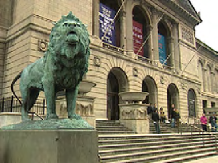
available on the DVD). The first pair includes a shot of the lions in front
of the Art Institute of Chicago. One was shot with proper white balance
(though fairly warm) and one was shot balanced blue. The second pair
includes an interview clip and a B-roll shot that need to cut back to back.
The third pair includes two clips from the same interview that was shot
outdoors as lighting conditions changed. And the final one is a seemingly
impossible match of two horribly overexposed and poorly white balanced
images of the Chicago Water Tower.
Craig Leffel, of Chicago post house Optimus, starts us out with his take on
the match of the Art Institute lions (
Figures 9.1
-
9.4
)
.
Leffel begins by analyzing the images and correcting the “base” image.
“I'm looking at these shadows,” he explains as he points to the black
areas above the three colored banners, “since they're the darkest shad-
ows that I can see the fastest. This,” he says, pointing to the shadowed
archways above the doors, “is also a good place to see texture; to see if
I'm cranking the blacks too hard or too harshly, this stuff will look pretty
awful pretty fast. I'm trying to get the blacks not to look milky and trying
to get some richness, but richness with separation. Just adding contrast
to an image and just crushing the blacks is not the same as trying to get
tonal separation and get richness. Especially when I'm working off some-
thing that I know is a piece of tape, I try to separate out as much dynamic
range as I can. The way I discern that is by the black to midtone relation-
ship and then the midtone to highlight relationship. And to me, when
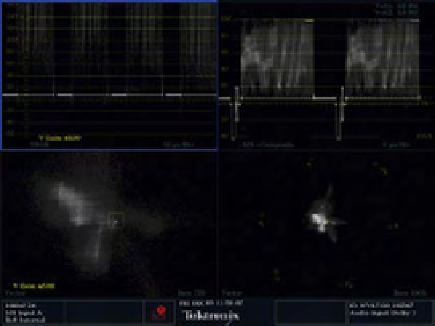
Fig. 9.2
Tektronix WVR7100 screengrab. Upper left: YRGB Parade.
Upper right: composite waveform. Lower right: vectorscope. Lower left:
vectorscope zoomed 5x.
Fig. 9.1
The “base” shot, though it's a little warm.
Search WWH ::

Custom Search