Graphics Reference
In-Depth Information
Walls should be a completely neutral gray: no tint at all. Paint mix-
ers have a very hard time with this. Bring an 18 percent grey photo card
to your local paint store and see if they can match it. Many color suites
aren't painted at all but are instead covered in gray cloth, which cuts
down on reflected light and glare.
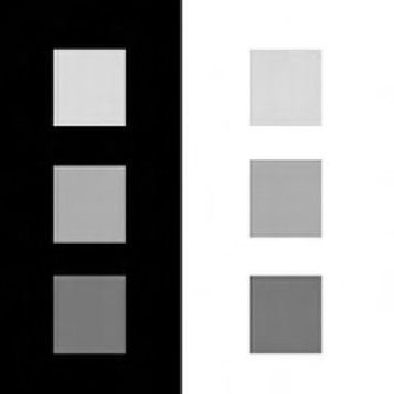
High-level colorists are very sensitive to their viewing environment.
Here's a simple test to prove how important the viewing environment
is to good color correction. Look at the following squares and determine
whether the blocks to the right are darker than the blocks to the left
(
Figure 1.6
)
. If you're familiar with optical illusions, you can probably
guess the right answer despite what your eyes are really telling you.
The color chips inside the black surround (to the right) appear to be
brighter than the ones on the white surround (to the left). The black surround
also makes the contrast ratio of the chips appear slightly lower. This is due to
a thing called
lateral-brightness adaptation
, which means that a particular reti-
nal receptor in the eye is affected by the brightness of the receptors coming in
to its neighboring receptors, which helps us detect edges better. (For more on
the color theory involved, check out
Digital Color Management: Encoding Solu-
tions
by Edward Giorgianni and Thomas Madden [Wiley]. Publication Date:
January 27, 2009
ǀ
ISBN-10: 047051244X
ǀ
ISBN-13: 978-0470512449)
High-level colorists are very sensitive to their viewing environment.
This sensitivity extends to very small stimuli, such as glowing on/off
switches on equipment and the color of the trace of the waveform or
Fig. 1.6
The environment around your monitor affects how you see what's in it.
Search WWH ::

Custom Search