Graphics Reference
In-Depth Information
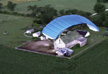
something like this that had so little contrast on the original and so many
colors as a result that are overlapping each other, that's about the only
excuse I can think of for using multiple secondaries. And so what I would
probably do here is try to go in and grab another secondary and maybe
start with a cyan grab on the parachute and see what happens. Try and
separate out the parachute completely, so that I'm only working on the
parachute.” Most qualifies a beautiful secondary, isolating the parachute.
“Right in there seems to get it. Blur the key a little bit. Then what I can do
is try and swing that away from the greenish/cyan back towards a blue. It
just makes it stand out more. Not sure I can do much with the saturation,
but I probably can in the primaries, now that I have it separated. Once
again swinging it more towards a pure blue than the cyanish-blue that we
were getting before. That creates separation” (
Figure 7.52
)
.
Fig. 7.52
Secondary correction of the parachute.
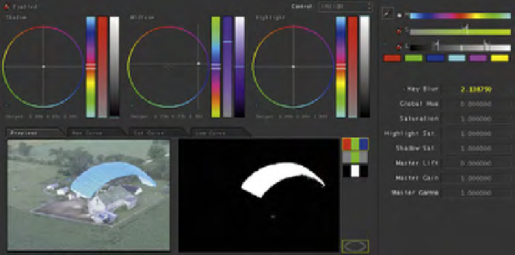
Fig. 7.53
Data from the Secondary room.
Search WWH ::

Custom Search