Graphics Reference
In-Depth Information
T I P
If you are trying to
remember which primary
colors blend together to
make a secondary color, all
you have to do is look at a
vectorscope. The secondary
color is between the two
primary colors that make it
(
Figure 3.19
).
T I P
If you are trying to remem-
ber a color's opposite
color, you can look directly
across the vectorscope. Any
color that is 180 degrees
from another color on the
vectorscope is its opposite.
This tip is handy if you are
trying to eliminate a blue
cast and you want to add a
color to “cancel it out”: the
answer is directly opposite
blue on the vectorscope—
yellow (
Figure 3.20
)
.
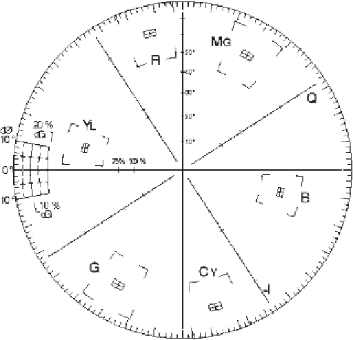
Fig. 3.19
The vectorscope is a great visual way to remember the relationships between colors.
T I P
Sometimes if you want
to make an image more
red, it may not be good to
actually add red, because
doing so will also increase
the luminance. If you want
to make an image more red
and reduce the luminance,
you can also decrease the
other two primary colors in
equal amounts. Using the
vectorscope to remember
these color relationships
is helpful. If you want to
increase yellow, you can
either decrease blue, which
is opposite yellow, or
you can increase the two
primary colors on either
side of yellow, which are
red and green.
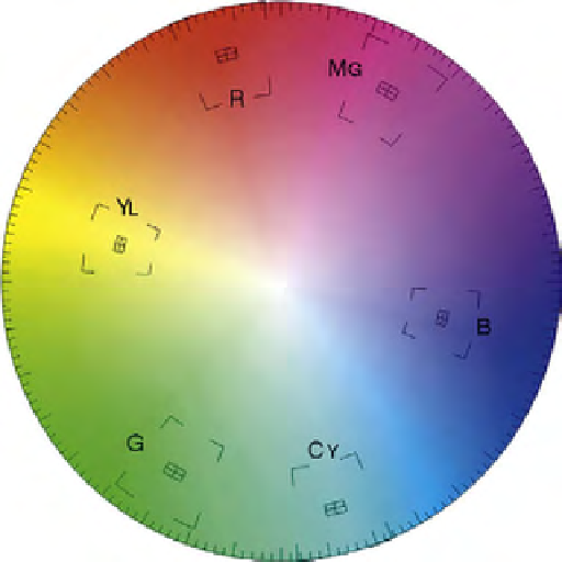
Fig. 3.20
Use the vectorscope to remember that the opposite of blue is yellow. The opposite of green is
magenta. The opposite of cyan is red.


Search WWH ::

Custom Search