Database Reference
In-Depth Information
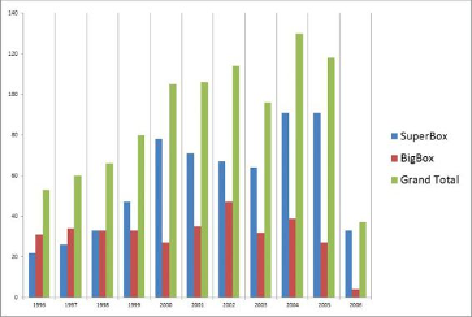
Figure 12.31
How to clean up a graphic, example 2 (before)
There are five main kinds of chart junk in
Figure 12.31
:
•
Vertical grid lines:
These vertical grid lines are not needed in this
graphic. They provide no additional information to help the viewer
understand the message in the data. Instead, these vertical grid lines only
distract the viewer from looking at the data.
•
Too much emphasis color:
This bar chart uses strong colors and too
much high-contrast dark grayscale. In general, it is best to use subtle
tones, with a low contrast gray as neutral color, and then emphasize the
data underscoring the key message in a dark tone or strong color.
•
No chart title:
Because the graphic lacks a chart title, the viewer is not
oriented to what he is viewing and does not have proper context.
•
Legend at right restricting chart space:
Although there is a legend
for the chart, it is shown on the right side, which causes the vertical bar
chart to be compressed horizontally. The legend would make more sense
placed across the top, above the chart, where it would not interfere with
the data being expressed.
•
Small labels:
The horizontal and vertical axis labels have appropriate
spacing, but the font size is too small to be easily read. These should be
slightly larger to be easily read, while not appearing too prominent.
Figures 12.32
and
12.33
portray two examples of cleaned-up versions of the chart
shown in
Figure 12.31
.
The problems with chart junk have been addressed. There