Database Reference
In-Depth Information
this issue, a new pricing model that accounts for this may enable an organization
to maximize revenue and minimize attrition by offering higher prices to more loyal
customers and lower prices to less loyal customers. Creating an iterative depicting
the data visually allows the viewer to see these changes in a more concrete way than
by looking at tables of numbers or raw values.
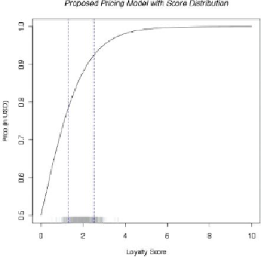
Figure 12.25
New proposed pricing model compared to prices in U.S. dollars
with rug
Data scientists typically iterate and view data in many different ways, framing
hypotheses, testing them, and exploring the implications of a given model. This
case explores visual examples of pricing distributions, fluctuations in pricing, and
the differences in price tiers before and after implementing a new model to
optimize price. The visualization work illustrates how the data may look as the
result of the model, and helps a data scientist understand the relationships within
the data at a glance.
The resulting graph in the pricing scenario appears to be technical regarding
the distribution of prices throughout a customer base and would be suitable for
a technical audience composed of other data scientists.
Figure 12.26
shows an
example of how one may present this graphic to an audience of other data scientists
or data analysts. This demonstrates a curvilinear relationship between price tiers
and customer loyalty when expressed as an index. Note that the comments to the
right of the graph relate to the precision of the price targeting, the amount of