Database Reference
In-Depth Information
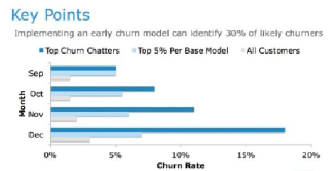
Figure 12.12
shows an example of providing supporting detail regarding the rate
of bank customers who would churn in various months. When developing the
key points, consider the insights that will drive the biggest business impact and
can be defended with data. For project sponsors, use simple charts such as bar
charts, which illustrate data clearly and enable the audience to understand the
value of the insights. This is also a good point to foreshadow some of the team's
recommendations and begin tying together ideas to demonstrate what led to the
recommendations and why. In other words, this section supplies the data and
foundation for the recommendations that come later in the presentation. Creating
clear, compelling slides to show the key points makes the recommendations more
credible and more likely to be acted upon by the customer or sponsor.
Figure 12.12
Example of a presentation of key points of a data science project
shown as a bar chart
For analyst presentations, use more granular or technical charts and graphs. In
this case, appropriate visualization techniques include dot charts, density plots,
ROC curves, or histograms of a data distribution to support decisions made in the
modeling techniques. Basic concepts of data visualization are discussed later in the
chapter.
12.2.7 Model Details
Model details are typically needed by people who have a more technical
understanding than the sponsors, such as those who will implement the code, or
colleagues on the analytics team. Project sponsors are typically less interested in
the model details; they are usually more focused on the business implications of
the work rather than the details of the model. This portion of the presentation
needs to show the code or main logic of the model, including the model type,
variables, and technology used to execute the model and score the data. The model