Database Reference
In-Depth Information
x.measure="fpr")
aucObj = performance(predObj, measure="auc")
plot(rocObj, main = paste("Area under the curve:",
round(aucObj@y.values[[1]] ,4)))
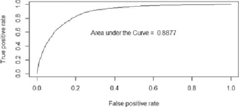
The usefulness of this plot in
Figure 6.15
is that the preferred outcome of a
classifier is to have a low FPR and a high TPR. So, when moving from left to right
on the FPR axis, a good model/ classifier has the TPR rapidly approach values
near 1, with only a small change in FPR. The closer the ROC curve tracks along the
vertical axis and approaches the upper-left hand of the plot, near the point (0,1),
the better the model/classifier performs. Thus, a useful metric is to compute the
area under the ROC curve (AUC). By examining the axes, it can be seen that the
theoretical maximum for the area is 1.
Figure 6.15
ROC curve for the churn example
To illustrate how the FPR and TPR values are dependent on the threshold value
used for the classifier, the plot in
Figure 6.16
was constructed using the following
R code:
# extract the alpha(threshold), FPR, and TPR values from
rocObj
alpha <- round(as.numeric(unlist(rocObj@alpha.values)),4)
fpr <- round(as.numeric(unlist(rocObj@x.values)),4)
tpr <- round(as.numeric(unlist(rocObj@y.values)),4)
# adjust margins and plot TPR and FPR
par(mar = c(5,5,2,5))
plot(alpha,tpr, xlab="Threshold", xlim=c(0,1),
ylab="True positive rate", type="l")
par(new="True")
plot(alpha,fpr, xlab="", ylab="", axes=F, xlim=c(0,1),