Database Reference
In-Depth Information
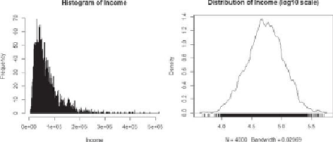
Figure 3.11
(a) Histogram and (b) Density plot of household income
Figure 3.11
(b) shows a density plot of the logarithm of household income values,
which emphasizes the distribution. The income distribution is concentrated in the
center portion of the graph. The code to generate the two plots in
Figure 3.11
is
provided next. The
rug()
function creates a one-dimensional density plot on the
bottom of the graph to emphasize the distribution of the observation.
# randomly generate 4000 observations from the log normal
distribution
income <- rlnorm(4000, meanlog = 4, sdlog = 0.7)
summary(income)
Min. 1st Qu. Median Mean 3rd Qu. Max.
4.301 33.720 54.970 70.320 88.800 659.800
income <- 1000*income
summary(income)
Min. 1st Qu. Median Mean 3rd Qu. Max.
4301 33720 54970 70320 88800 659800
# plot the histogram
hist(income, breaks=500, xlab="Income", main="Histogram of
Income")
# density plot
plot(density(log10(income), adjust=0.5),
main="Distribution of Income (log10 scale)")
# add rug to the density plot
rug(log10(income))
In the data preparation phase of the Data Analytics Lifecycle, the data range
and distribution can be obtained. If the data is skewed, viewing the logarithm of
the data (if it's all positive) can help detect structures that might otherwise be
overlooked in a graph with a regular, nonlogarithmic scale.